
In data visualization, the use of rhetoric techniques to persuade viewers and bring out stories in each information is mostly used. The rhetoric used varies from the linguistic techniques and procedural rhetorics. A person believes what they see; therefore the use of rhetoric is to create an image in the mind of the Audience and viewers to understand the intentions of the writer. It is writing skill and data representation technique which is essential to relay messages (Kostelnick, 2008). Data visualization can be presented in infographics, art projects, music, and video and written articles. The use of rhetoric is vital in passing on messages to the viewers and readers. One needs to understand how to use rhetoric to create images through the words and language use. Linguistic rhetoric includes the use of appropriate tone, use of ethos, pathos, and logos. This is aimed at creating the best scenario in data representation. Other classes of rhetoric information access include provenance mapping and procedural rhetoric. The use of rhetoric visualization can be seen in examples of infographics, artistic images and digital marketing (Hullman & Diakopoulos, 2011).
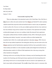
A good example is data visualization is the gif in the percentage representation of the US population by age group which provides excellent insights and compelling way of data visualization. The gif has used rhetoric in data representation; it is creating a visual image of how the population changes over the years in different age groups. The use of gif in this data representation is it tells a great story in a matter of second. It brings the representation of how the American population is going to be like in the future. The use of a suitable gift way to put rhetoric data visualization since it shows how the population changes with a change in years. The gif is easy to share and can be shared among a large group of viewers at a time. It is not time-consuming, and the graphics are captivating to the viewers (Dove & Jones, 2012).
The programmer of this data has addressed time efficiency and compressed the data into a simple gif video. One can take less time to understand study the data represented in the American population. The programmer has grouped different age groups and replays the same age group for different years. The good thing with a gif is that it is short and replays over and over again to bring the intended message to the viewer.
The data representation in this gif shows the changing demographics of the United States population over the years. The compressed data is information on the age group changes from 1950 up to 2050. This information seeks to answer questions about American demographic changes of the century. It answers the questions of how gender population changes, the different population at different age groups and the changes in the population over each year since 1950. It represents past data and population prediction that is compressed in a single gif. This data is easy to share and represent in blogs.
Data visualization gives an effective way of communication among the viewers; it is a simple and faster way of sharing information with a significant number of viewers. It is easy to understand and does not consume a lot of time in bringing information to live presentation. It is also easy to share with different people. Rhetoric data visualization is the modern way to go for programmers and authors (Kosara & Mackinlay, 2013).
References
Dove, G., & Jones, S. (2012). Narrative visualization: sharing insights into complex data. http://www.pewresearch.org/files/2014/04/847889448.gif
Hullman, J., & Diakopoulos, N. (2011). Visualization Rhetoric: Framing Effects in Narrative Visualization. IEEE Transactions on Visualization and Computer Graphics, 17(12), 2231-2240.
Kosara, R., & Mackinlay, J. (2013). Storytelling: The next step for visualization. Computer, 46(5), 44-50.
Kostelnick, C. (2008). The visual rhetoric of data displays The conundrum of clarity. IEEE Transactions on Professional Communication, 51(1), 116-130.
Request Removal
If you are the original author of this essay and no longer wish to have it published on the customtermpaperwriting.org website, please click below to request its removal:

